One Typeface, Worn Well
Type as the clothing your words wear
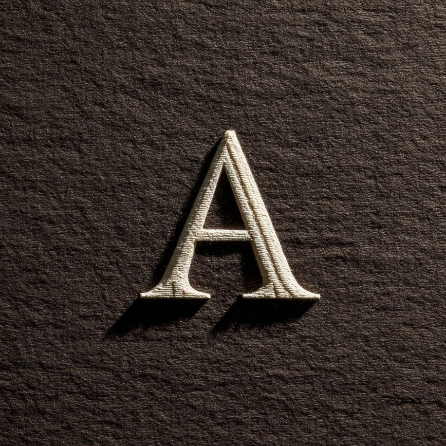
You can recognize certain people by their coat. The studios you remember dress their words the same way — one typeface, worn until it belongs to them.
There is a person in every neighbourhood you could identify from a hundred metres by their coat alone. Not a wardrobe — a coat. One good one, worn in every season, worn until the coat and the person have merged into a single recognisable shape. The studios you remember dress their words the same way.
Somewhere along the line, having access to ten thousand fonts got confused with needing them. But a voice isn't built from variety. It's built from repetition — the same typeface, set with the same care, appearing everywhere you do, until the letterforms themselves start doing the introducing.
Why one is louder than many
Every additional typeface on a page divides the reader's trust by two. One face, used for years, compounds. When our serif appears — on a planner cover, an invoice, this very journal — it carries every previous encounter with it. That's not a font anymore; it's a signature. The economy is the point: one decision, made once, working for you on every page you'll ever set.
Choosing the coat
Choose the way you'd choose a coat you intend to keep for a decade. Try it in every weather: does it hold up at 9pt in a caption and at 90pt on a cover? Does the italic have a life of its own without becoming a costume? Does it feel like you on a tired Tuesday, not just at the opening? A typeface you'll wear daily should flatter your ordinary work, not your imagined work.
Wearing it well
A good coat still needs to fit. Wearing a typeface well is mostly restraint: a small set of sizes you repeat everywhere, generous leading, one weight doing the talking and one whispering. Most typographic mess isn't a bad font — it's a good font worn six ways at once. Set your sizes once, write them down, and stop re-deciding.
The accompanist
One coat, yes — but you're allowed a scarf. A second face, much quieter, for the functional layer: captions, labels, the small print. The rule is that it must accompany, never compete. Ours is a plain sans that hardly anyone notices, which is exactly the job description. If both faces are interesting, the page has two lead singers and no song.
The letters you set your life in are not a detail. They're the voice your words arrive in before anyone reads them. Choose one. Wear it for years. Let it become the coat by which people recognise you from across the street.
In The Studio Archive this week: the studio's type wardrobe, opened — our exact faces, sizes, and settings, plus six tested pairings you can wear straight away. The post is the philosophy; the file is the fitting.