Negative Space is a Material
Treating air, margin, and asymmetry as the design itself — the quiet confidence of restraint
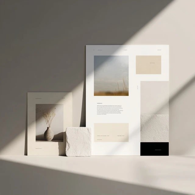
We're taught to fill space. The best designers do the opposite — they treat emptiness as a material to be shaped, as deliberately as any line or word.
In music, the silence between notes is not the absence of music — it's part of the composition. Remove it and you don't get more music; you get noise. Design works exactly the same way, and yet we're trained to treat the empty parts of a page as leftovers, as space we simply haven't filled yet. The best work treats emptiness as a material — something to be shaped as deliberately as any line, image, or word.
Negative space isn't what's left over. It's a decision. And once you start seeing it as a material you can shape, your whole eye changes.
Emptiness is where the eye rests
A page with no room to breathe exhausts the reader before they've begun. The empty areas are where attention recovers — the pauses that let the important things land. A single image on a wide field of cream carries more weight than ten images competing for the same square inch. Space doesn't dilute your work. It concentrates it.
Margin is a message
The amount of room you leave around something tells the reader how to value it. Cramped margins whisper ordinary, hurried, plenty more where this came from. Generous ones say this is worth your attention. It's the same instinct as a gallery hanging one painting on a large wall — the emptiness is doing the talking, and what it says is look closely. Margin is never neutral. It's always sending a signal.
Asymmetry is alive; symmetry is asleep
Perfect symmetry is stable, and stability, past a point, becomes lifeless. A little asymmetry — an image pushed to one edge, a title that doesn't centre, weight that leans — creates tension, and tension is what makes a static page feel alive. Balance doesn't require sameness. The most compelling layouts are balanced the way a good room is: unevenly, on purpose.
Restraint is the hardest confidence
Adding is easy; it feels like effort, like progress. Removing is hard, because it asks you to trust that what remains is enough. But every element you take away makes the ones that stay louder. Designing with negative space is really an exercise in nerve — the confidence to leave a thing alone and let the emptiness carry it.
So the next time a layout feels wrong, resist the urge to add. Ask instead what you could take away, and how much more room the survivors could have. Treat the space as the design, not the gaps in it, and the work starts to feel less like a page and more like a gallery.
This is the principle underneath every template we make — the reason our pages feel calm. In The Studio Archive, we turn it into a practical field guide: exact margins, spacing ratios, and a reference set you can measure against.