Work That Belongs in a Magazine
The few editorial moves that turn a folder of work into an art piece worth keeping
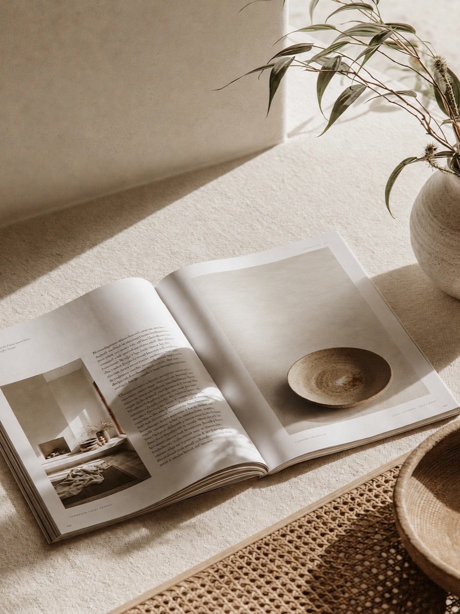
The gap between a folder of work and a portfolio worth keeping is smaller than it looks. It comes down to a few editorial decisions most people never make on purpose.
Two portfolios can hold the exact same projects and feel worlds apart. One looks like a folder someone exported in a hurry. The other looks published — like it was made to sit on a shelf beside the design books, not inside a downloads folder. The difference is almost never the work. It's a handful of editorial decisions, made on purpose, that most people never make at all.
You don't need better projects to look like a magazine. You need to treat your projects the way a magazine would: with restraint, rhythm, and a point of view. Here are the moves that do most of the work.
1. Give it margins it doesn't seem to need
The fastest way to look amateur is to fill the page. The fastest way to look published is to leave room. Generous, almost uncomfortable margins signal confidence — they tell the reader this work doesn't need to shout. White space is not wasted space; it's the frame that makes the image inside it feel valuable. When in doubt, add more air than feels reasonable, then a little more.
2. Choose one confident typeface and commit
Amateur portfolios hedge with three or four fonts. Editorial ones commit to one, maybe two, and let contrast come from size and weight instead of variety. A single confident serif, set large for titles and quiet for captions, will carry an entire document with more authority than any font pairing you agonise over. Restraint reads as taste. Variety reads as uncertainty.
3. Allow yourself exactly one accent
Colour is where most portfolios lose their nerve, reaching for a rainbow to seem lively. The opposite is true. One warm accent — used on a single rule, a page number, a lone mark — is more sophisticated than a palette of five. It becomes a signature. The eye reads discipline as intention, and intention as skill.
4. Build a grid, then let the images breathe on it
A quiet underlying grid is what separates a designed spread from a decorated one. It doesn't need to be visible; it needs to be felt. Align everything to the same few lines and even a busy project reads as calm. Then give your best images room to be full-bleed and large — a grid earns you the right to break it, once, powerfully.
5. Caption like an editor, not a student
Short, confident captions in a small, tracked label read as editorial. Long explanatory paragraphs read as anxious. Trust the work to speak, and let the words point rather than justify. A project title, a year, a one-line description — usually that's enough.
None of these are talent. They're decisions — the same ones a good art director makes on every page, out of habit. Make them consistently and your work stops looking submitted and starts looking published.
We've packed exactly these decisions into our portfolio templates, so the grid, the type, and the single accent are already made for you. And in The Studio Archive, we tear one down page by page — the annotated version of this post.