Proof, on Paper
Why the studio prints everything once
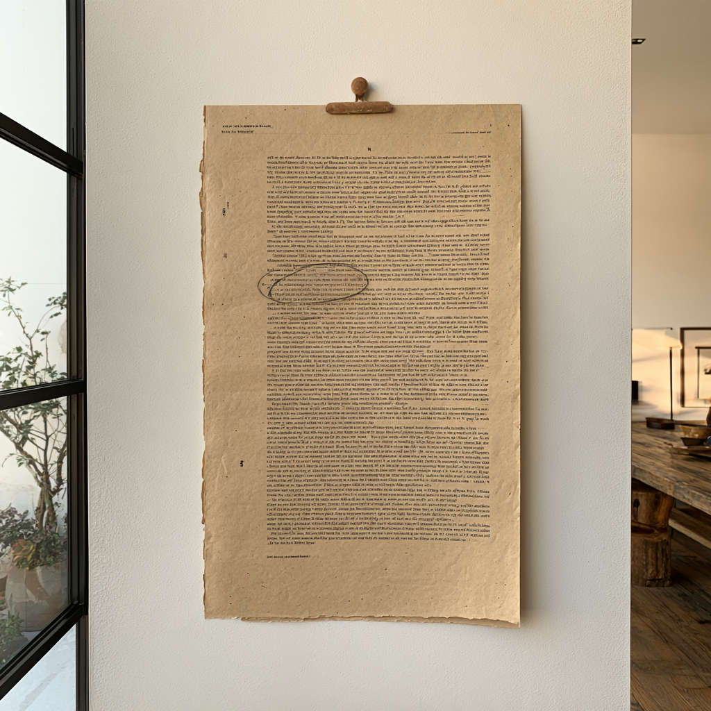
What a paper proof reveals about spacing, type, and honesty that the screen politely conceals — and how to run a proof ritual at home.
The screen is a flattering mirror. It backlights everything, forgives thin type, makes every grey generous and every margin wider than it is. You can work in that mirror for weeks and believe the page is finished. Then you print it once, hold the paper at arm's length — and the page tells you the truth it was saving up: the heading is too tight, the grey is a whisper, and something about the bottom third has been wrong the entire time.
Everything the studio ships — planner, template, this journal in its PDF form — meets paper before it meets the world. Not because most of it will live on paper, but because paper is the only reader that doesn't flatter. The proof is where design stops being a picture of a page and becomes a page.
What only paper will tell you
A short list from years of proofs. Spacing: the screen compresses your sense of distance; margins that felt generous at 100% zoom arrive mean in the hand. Type colour: what reads as elegant lightness on a backlit panel prints as fog. Hierarchy: squint at a print from across the room and the page's real structure declares itself — or fails to. And scale, the humbling one: the beautiful 9pt caption you set is, in the hand, a test of your reader's goodwill. None of this is discoverable in the mirror. All of it is on the first sheet out of the printer.
The arm's-length reading
The ritual itself is modest. Print one copy, cheapest paper, no ceremony. Pin it up or hold it at arm's length — the distance matters, because it's the distance at which strangers meet your work. Read it once as a stranger (fast, skimming, slightly impatient) and once as an editor (pencil out, circling everything that snags). Two passes, five minutes. The pencil marks are the file's honest to-do list, and they are never empty. Ours aren't either — the Archive this week has the evidence.
Mark it like a printer
Learn five proofing marks and the pencil pass gets faster and kinder: tighten, open, raise, lower, and the long horizontal S that means something is off here, come back. Marking a proof in a small shared language — even if you only share it with yourself — turns vague unease into a work list. Vague unease is the enemy; it follows projects around for weeks. A circled line is just Tuesday's task.
Proof the digital, too
The counterintuitive habit: we proof things that will never be printed by anyone else. Social tiles, web pages, the newsletter you're reading. Paper still catches what it always catches — the spacing, the fog, the sagging bottom third — because those flaws were never screen-specific. The screen just hid them. If it will be seen by eyes, it can be proofed on paper. The paper doesn't need to know it's a website.
One print, two readings, a pencil. The cheapest quality control in the entire discipline — and the plainest-spoken friend your work will ever have.
In The Studio Archive this week: a real proof from the studio, pencil marks and all, with every mark explained — plus the proof checklist and the five marks on a printable card. The post is the argument; the file is the marked-up sheet.