A Grid Is Quiet Hospitality
The setting that lets a page be generous
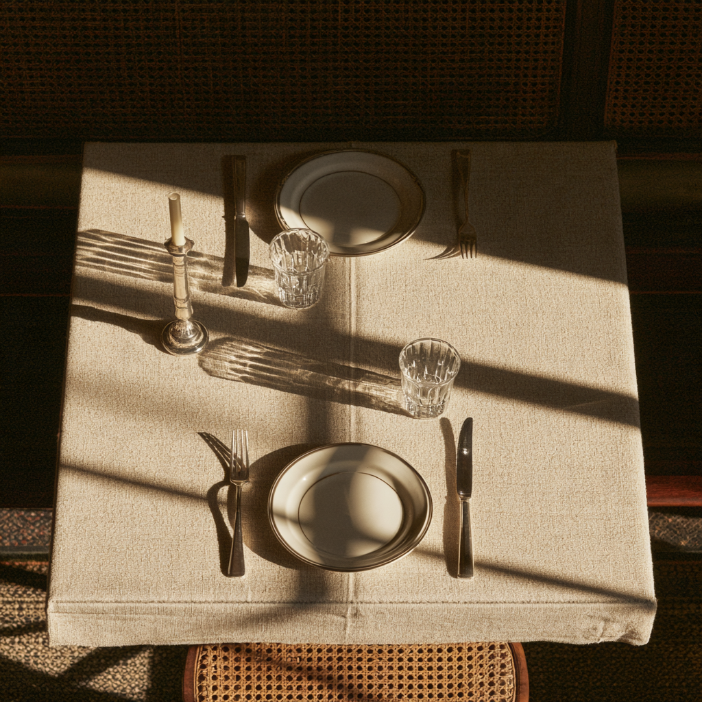
A well-set table doesn't make dinner rigid. It makes guests feel expected. A grid does for the reader what the table does for the guest.
Think of the best dinner you've ever been a guest at. Somebody set that table before you arrived. The plates aligned, the glasses where your hand would look for them, the napkin folded — not to impress you, but so that when you sat down, everything already knew you were coming. You probably never noticed the setting. You noticed feeling expected.
That is what a grid is. Somewhere along the way, grids got a reputation for strictness — the graph-paper police, the enemy of feeling. But the grid was never the opposite of warmth. It's the mechanics of it. A grid is the page setting its table.
What the reader's hand looks for
A reader arrives at a page the way a guest arrives at dinner: with unconscious expectations about where things will be. Where the text begins. How far the eye drops to continue. Where the image sits relative to its caption. A grid answers those questions once, kindly, and then keeps every promise — so the reader never has to spend attention navigating. The energy they save is the energy they spend actually reading.
Strict frame, generous room
The paradox seasoned designers know: the firmer the underlying structure, the more generous the page can afford to be. A wandering layout has to keep proving it isn't lost, so it clings to symmetry and fills space nervously. A page on a confident grid can leave a whole column empty, let an image break the edge, drop a single line into silence — and it all reads as intended, because the table underneath never moves. Restraint only lands as confidence when there's a structure to be restrained against.
Hospitality has a measure
In the studio, the grid is where our spacing scale (the field guide behind Negative Space Is a Material) actually lives. Column, gutter, baseline: three numbers, chosen once per project, that quietly decide whether the page feels like a place a person can stay. Too tight and the guest feels crowded; too loose and they wonder if anyone's home. The numbers are in this entry's file — but the point is that they are numbers. Care, in layout, is measurable.
When to clear the table
And sometimes — one moment per piece, rarely more — you break the grid on purpose: the image that bleeds off every edge, the headline that ignores the columns. It works precisely because the table was set. A broken rule on a ruled page is emphasis. A broken rule on a lawless page is just more weather.
So set the table. Not because design has laws, but because someone is coming — and the quietest luxury a page can offer is the feeling of being expected.
n The Studio Archive this week:the studio's grid recipes — the five settings we actually cook from, with every measurement — ready to use straight away. The post is the welcome; the file is the place setting.